 React Component
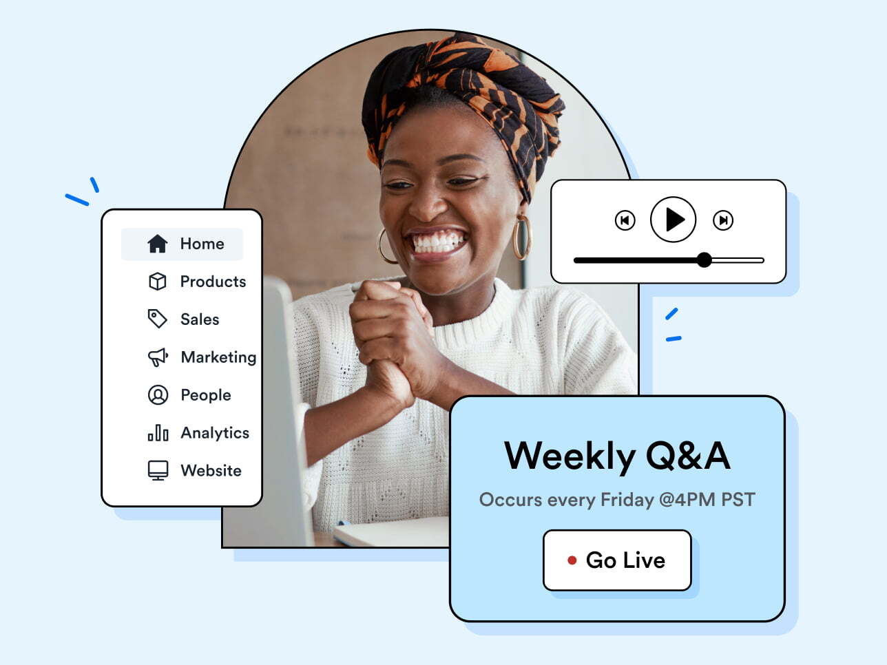
Learn with Kajabi in our live workshops
Did you know we offer free workshops? Kajabi experts host live workshops every week on topics from marketing your products to building out your Kajabi account.
A Hero is used to call attention to new features or content. The hero is flexible in size and can contain text, illustrations, full-bleed images, and a full-bleed video thumbnail.
There are two sizes for the Hero component: small and large. The small Hero component takes up a portion of the viewport width and the large Hero component takes up the entire viewport width.
Did you know we offer free workshops? Kajabi experts host live workshops every week on topics from marketing your products to building out your Kajabi account.
Did you know we offer free workshops? Kajabi experts host live workshops every week on topics from marketing your products to building out your Kajabi account.
When the Hero is set to borderless, the Hero will have no border.
Did you know we offer free workshops? Kajabi experts host live workshops every week on topics from marketing your products to building out your Kajabi account.
When the Hero is set to contained, the Hero will have margins that push the image away from the sides of the Hero container.
Did you know we offer free workshops? Kajabi experts host live workshops every week on topics from marketing your products to building out your Kajabi account.

When the Hero has a custom background color, the background color will be applied to the entire Hero.
Did you know we offer free workshops? Kajabi experts host live workshops every week on topics from marketing your products to building out your Kajabi account.
When the image is set to start, the image will be placed at the start of the Hero component.
Did you know we offer free workshops? Kajabi experts host live workshops every week on topics from marketing your products to building out your Kajabi account.
When the Hero has a CTA attribute, the CTA will be applied to the Hero image.
Did you know we offer free workshops? Kajabi experts host live workshops every week on topics from marketing your products to building out your Kajabi account.
When the Hero has a shadow, a box-shadow will be applied to the Hero container.
Did you know we offer free workshops? Kajabi experts host live workshops every week on topics from marketing your products to building out your Kajabi account.
SageHero
<h2>Sizes</h2>
<p>There are two sizes for the Hero component: small and large. The small Hero component takes up a portion of the viewport width and the large Hero component takes up the entire viewport width.</p>

<h3>Small</h3>

<%= sage_component SageHero, {
  title: "Learn with Kajabi in our live workshops",
  description: "Did you know we offer free workshops? Kajabi experts host live workshops every week on topics from marketing your products to building out your Kajabi account.",
  image: "hero-workshop-placeholder.jpg",
  alt_text: "Multi-layered illustration of UI elements and woman clasping her hands together in excitement",
  size: "small",
} do %>
  <% content_for :sage_hero_footer_actions do %>
    <%= sage_component SageButton, {
      value: "Learn more",
      style: "primary",
    } %>
  <% end %>
<% end %>

<h3>Large</h3>
<%= sage_component SageHero, {
  title: "Learn with Kajabi in our live workshops",
  description: "Did you know we offer free workshops? Kajabi experts host live workshops every week on topics from marketing your products to building out your Kajabi account.",
  image: "hero-workshop-placeholder.jpg",
  alt_text: "Multi-layered illustration of UI elements and woman clasping her hands together in excitement",
  size: "large",
} do %>
  <% content_for :sage_hero_footer_actions do %>
    <%= sage_component SageButton, {
      value: "Learn more",
      style: "primary",
    } %>
  <% end %>
<% end %>

<%= sage_component SageDivider, {} %>

<h2>Borderless</h2>
<p>When the Hero is set to borderless, the Hero will have no border.</p>

<%= sage_component SageHero, {
  title: "Learn with Kajabi in our live workshops",
  description: "Did you know we offer free workshops? Kajabi experts host live workshops every week on topics from marketing your products to building out your Kajabi account.",
  image: "hero-workshop-placeholder.jpg",
  alt_text: "Multi-layered illustration of UI elements and woman clasping her hands together in excitement",
  size: "small",
  borderless: true,
} do %>
  <% content_for :sage_hero_footer_actions do %>
    <%= sage_component SageButton, {
      value: "Learn more",
      style: "primary",
    } %>
  <% end %>
<% end %>

<%= sage_component SageDivider, {} %>

<h2>Contained</h2>
<p>When the Hero is set to contained, the Hero will have margins that push the image away from the sides of the Hero container.</p>

<%= sage_component SageHero, {
  title: "Introducing the Kajabi template store",
  description: "Did you know we offer free workshops? Kajabi experts host live workshops every week on topics from marketing your products to building out your Kajabi account.",
  image: "hero-contained-placeholder.png",
  alt_text: "Multi layered illustration of UI elements and woman smiling to the camera",
  size: "small",
  contained: true,
} do %>
  <% content_for :sage_hero_footer_actions do %>
    <%= sage_component SageButton, {
      style: "primary",
      value: "Learn more",
    } %>
  <% end %>
<% end %>

<%= sage_component SageDivider, {} %>

<h2>Custom Background</h2>
<p>When the Hero has a custom background color, the background color will be applied to the entire Hero.</p>

<%= sage_component SageHero, {
  title: "Learn with Kajabi in our live workshops",
  description: "Did you know we offer free workshops? Kajabi experts host live workshops every week on topics from marketing your products to building out your Kajabi account.",
  image: "hero-workshop-placeholder.jpg",
  alt_text: "Multi-layered illustration of UI elements and woman clasping her hands together in excitement",
  custom_background_color: "#e6f4fe",
  size: "small",
} do %>
  <% content_for :sage_hero_footer_actions do %>
    <%= sage_component SageButton, {
      style: "primary",
      value: "Learn more",
    } %>
  <% end %>
<% end %>

<%= sage_component SageDivider, {} %>

<h2>Image Start</h2>
<p>When the image is set to start, the image will be placed at the start of the Hero component.</p>

<%= sage_component SageHero, {
  title: "Learn with Kajabi in our live workshops",
  description: "Did you know we offer free workshops? Kajabi experts host live workshops every week on topics from marketing your products to building out your Kajabi account.",
  image: "hero-workshop-placeholder.jpg",
  alt_text: "Multi-layered illustration of UI elements and woman clasping her hands together in excitement",
  size: "small",
  image_start: true,
} do %>
  <% content_for :sage_hero_footer_actions do %>
    <%= sage_component SageButton, {
      value: "Learn more",
      style: "primary",
    } %>
  <% end %>
<% end %>

<%= sage_component SageDivider, {} %>

<h2>CTA Attribute</h2>
<p>When the Hero has a CTA attribute, the CTA will be applied to the Hero image.</p>

<%= sage_component SageHero, {
  title: "Learn with Kajabi in our live workshops",
  description: "Did you know we offer free workshops? Kajabi experts host live workshops every week on topics from marketing your products to building out your Kajabi account.",
  image: "hero-workshop-placeholder.jpg",
  alt_text: "Multi-layered illustration of UI elements and woman clasping her hands together in excitement",
  size: "small",
  cta_attributes: {
    "data-js-modaltrigger": "cool-modal",
    href: "#",
  },
} do %>
  <% content_for :sage_hero_footer_actions do %>
    <%= sage_component SageButton, {
      value: "Learn more",
      style: "primary",
    } %>
  <% end %>
<% end %>

<%= sage_component SageDivider, {} %>

<h2>Shadow</h2>
<p>When the Hero has a shadow, a box-shadow will be applied to the Hero container.</p>

<%= sage_component SageHero, {
  title: "Learn with Kajabi in our live workshops",
  description: "Did you know we offer free workshops? Kajabi experts host live workshops every week on topics from marketing your products to building out your Kajabi account.",
  image: "hero-workshop-placeholder.jpg",
  alt_text: "Multi-layered illustration of UI elements and woman clasping her hands together in excitement",
  size: "small",
  borderless: true,
  shadow: "100",
} do %>
  <% content_for :sage_hero_footer_actions do %>
    <%= sage_component SageButton, {
      value: "Learn more",
      style: "primary",
    } %>
  <% end %>
<% end %>

<%# This is the modal triggered from various examples in this documentation %>
<%= sage_component SageModal, { id: "cool-modal"} do %>
  <%= sage_component SageModalContent, {
    title: "Modal title",
  } do %>
    <% content_for :sage_header_aside do %>
      <%= sage_component SageButton, {
        style: "secondary",
        subtle: true,
        value: "Close Modal",
        icon: { name: "remove", style: "only" },
        attributes: { "data-js-modal": true }
      } %>
    <% end %>

    <p>Add a description of the content you're showing in the modal.</p>

    <% content_for :sage_footer do %>
      <%= sage_component SageButton, {
        style: "secondary",
        value: "Cancel",
      } %>
      <%= sage_component SageButton, {
        style: "primary",
        value: "Confirm",
      } %>
    <% end %>
  <% end %>
<% end %>
| Property | Description | Type | Default |
|---|---|---|---|
|
Sets the ( |
String |
|
|
Removes border from Hero. |
Boolean |
|
|
Creates the toggle button for the component. |
Sage Component |
|
|
Include this property in order to activate a "play button" action on the image. This property allows for adding attributes to the Hero image. |
Hash |
|
|
Adjusts layout to support images that are NOT full bleed. |
Boolean |
|
|
Sets a custom background color for Hero. |
String |
|
|
Sets description text for the Hero |
String |
|
|
Image for the Hero. |
String |
|
|
Size for the hero container. |
String: ["small", "large"] |
|
|
Sets the horizontal placement of the image to start within the Hero. |
Boolean |
|
|
Sets the box-shadow on the Hero. |
String: ["none", "050", "100", "150", "200", "300", "400", "500"] |
|
|
Sets the title for the component. |
String |
|
|
Sets the heading tag ( |
String |
|
Sections |
|||
|
This area can hold buttons or other CTAs in the content area. |
||
When you want to deliver a powerful message, statement, or value proposition immediately upon a user a page or view.
To provide a visually compelling first impression.
For limited-time events or promotions, where the emphasis is timely and needs immediate attention.
If there’s a risk that the Hero might overshadow or distract from other critical content or actions on the page.